
Anatomy of a Mood Board: How a Single Reference Can Define an Entire Campaign
Every campaign starts with an image. Sometimes it is a photograph torn from an old magazine, sometimes a film still half-remembered, sometimes a piece of architecture noticed in passing. That single image carries something a brief alone cannot: a feeling. The work of art direction is, in many ways, the work of finding that feeling and translating it, faithfully, into something the world can see.
A mood board is not decoration.
It is the first draft of a campaign, written in pictures.
Why one reference matters more than fifty
There is a temptation, especially early in a project, to gather everything. Hundreds of images pinned to a digital wall, each one beautiful, each one suggestive of a different direction. The result feels generative but is usually the opposite: a board so dense it commits to nothing.
The discipline lies in subtraction. The strongest mood boards begin with a single anchor reference, an image that captures the emotional centre of the campaign so precisely that everything else must either support it or be cut. That anchor might be the colour temperature of a Hammershøi interior. It might be the posture of a model in a 1996 editorial. It might be the silence of an empty hotel lobby at six in the morning. What matters is that the reference is specific enough to make decisions easier, not harder.
The discipline of a mood board is not in what it includes, but in what it has the courage to leave out.
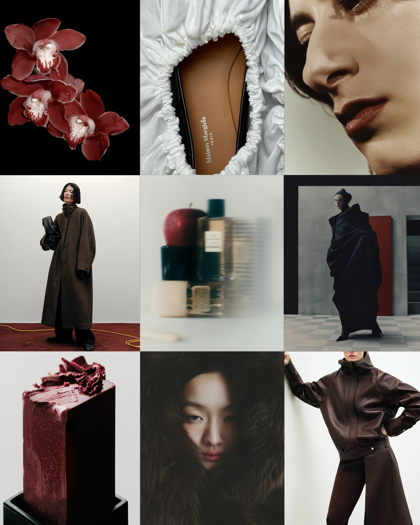
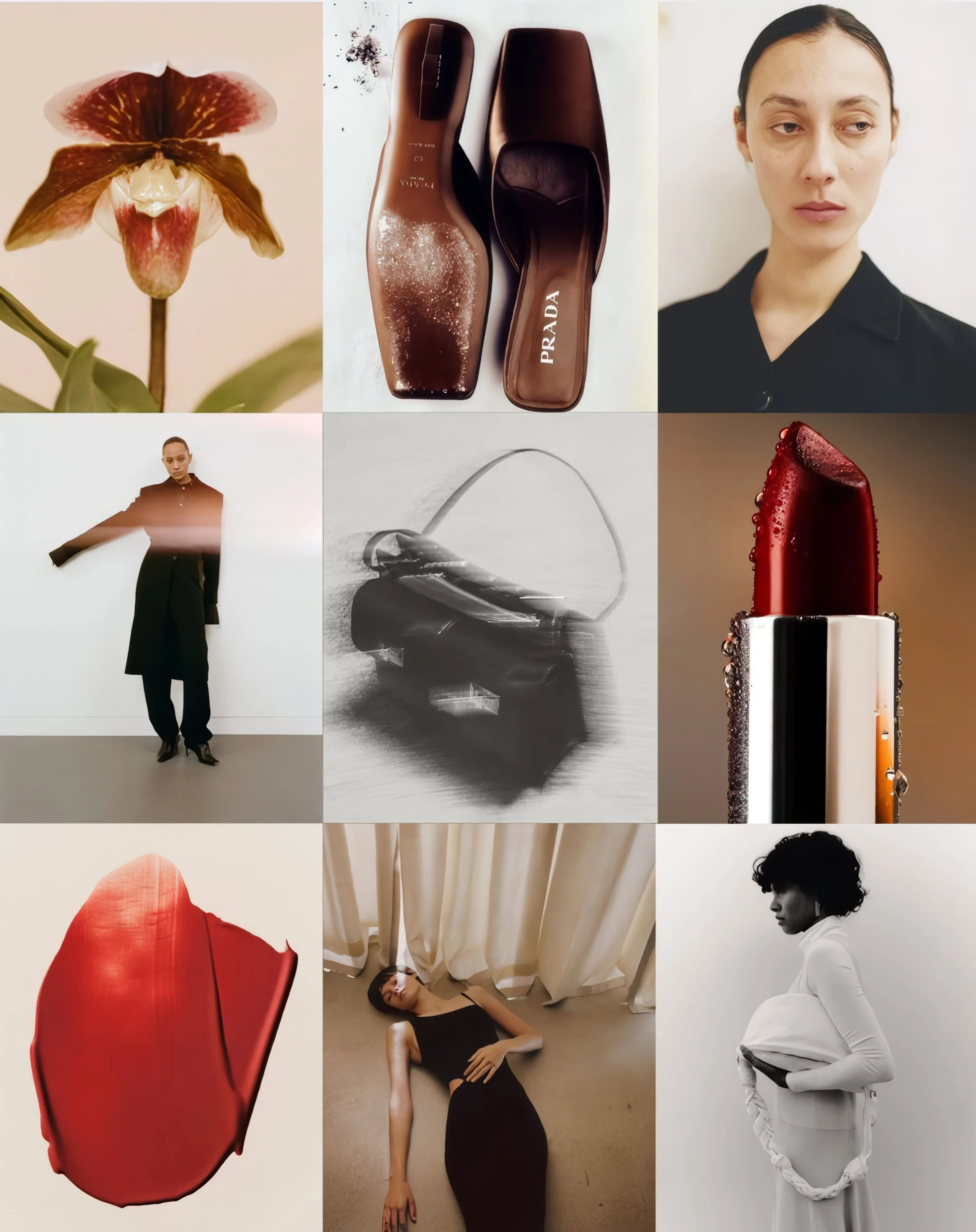
The four layers of a working mood board
Once the anchor is set, the board builds outward in layers. Each layer answers a different question, and each contributes to a coherent visual world rather than competing for attention.
1. Atmosphere
The light, the weather, the time of day. This is the most intangible layer and often the most important. Atmosphere is what determines whether an image feels nostalgic or immediate, intimate or remote. References here might come from cinema, from painting, or from photography that has nothing to do with fashion. A still from a Kieślowski film can teach more about atmosphere than a hundred campaign images.
2. Posture and gesture
How does the body sit in the frame? Is it relaxed, charged, withdrawn, theatrical? Posture references are usually drawn from documentary photography, dance, or street imagery, places where the body has not been arranged for a camera. They prevent the casting and styling from defaulting to a generic editorial language.
3. Texture and material
Close-up references that establish the tactile vocabulary of the shoot. Linen catching late afternoon light. The grain of unprocessed film. Concrete with a single shadow falling across it. These details often inform decisions far beyond the image itself, including location, set design, and post-production treatment.
4. Tension
The most overlooked layer, and the one that separates a memorable campaign from a competent one. Every strong visual world contains a contradiction. Softness against severity. Luxury against banality. Stillness against motion. The tension reference makes that contradiction explicit and ensures the campaign has somewhere to go.

When the references stop competing and start agreeing, the campaign has somewhere to begin.
Reading a mood board the way a director reads a script
When the board is complete, it should be possible to read it the way a director reads a script: linearly, with a sense of rhythm and intention. The viewer's eye should move through it the way a viewer's eye will eventually move through the campaign itself. If the board feels static, the campaign will feel static. If it feels noisy, the campaign will feel noisy.
A useful test, before any shoot, is to remove every caption, every annotation, every brand reference, and ask whether someone unfamiliar with the project could describe the mood in a single sentence. If they can, the board is doing its job. If they cannot, something needs to be cut.
If a stranger can describe it in one sentence, the board is doing its job. Everything else is just decoration in disguise.
From board to set
The mood board is a contract between the studio, the brand, and the team that will eventually stand on set. Every decision made afterward, the choice of photographer, the casting, the location, the lens, the colour grade, can be traced back to a specific reference and defended on its terms. This is what allows a shoot to move quickly and a campaign to feel inevitable in retrospect.
It also gives the brand something rare: the ability to see, before any cost is committed, exactly what the campaign will feel like. Not what it will look like, image by image, but what it will feel like as a whole. That is the deeper purpose of the mood board, and the reason a single, well-chosen reference is worth more than a wall full of beautiful ones.

Photography @hailunma
A note on building your own
If you are a brand approaching a shoot, the most useful thing you can bring to the first creative conversation is not a board of your own. It is a single image, anywhere from any source, that captures something you cannot articulate in words. Bring that, and the rest of the work has somewhere honest to begin.